
Wednesday, 22 May 2013
Final Cover
Whoops, I also forgot to put this on here too. Not much change, just got rid of the texture in the background.


Tuesday, 21 May 2013

Monday, 20 May 2013
Final double page spread
Yep, more colour changes. But the overall effect is good. It fits the background more and seems less messy so..it's all good!


Also some more quotes added to fill space and more layout changes, to be a bit more simplistic and easier to understand...
Monday, 21 January 2013
DONE!
I'm...I'm done?! YEAAAAHHHHH! I did it! *Smacks head onto keyboard from tiredness*.
Although I might have went on a bit of a tangent at times, I feel like I stuck with the task well and achieved pretty much what I have set out to do from the beginning. It feels like ages ago since I set out my original layout plan, but now that I'm done I can certainly tell I have improved dramatically, especially in the use of Photoshop and such.
Ah well. I can now put this all behind.....
*Teacher walks in* Uh, William, could you re-do this please?
AHGHHHGHGHGHG!!!
Although I might have went on a bit of a tangent at times, I feel like I stuck with the task well and achieved pretty much what I have set out to do from the beginning. It feels like ages ago since I set out my original layout plan, but now that I'm done I can certainly tell I have improved dramatically, especially in the use of Photoshop and such.
Ah well. I can now put this all behind.....
*Teacher walks in* Uh, William, could you re-do this please?
AHGHHHGHGHGHG!!!
Thursday, 3 January 2013
Evaluation TIIIIMMMMEE!
I have created a magazine cover, contents and double page spread for a pop punk music magazine targeted towards a lower class teenage/young adult audience. In this evaluation, I will explore and evaluate the various features this magazine has.
1. In what ways does your media product use, develop or challenge forms and conventions of real media products?
2. How does your media product represent particular social groups?
3. What kind of media institution might distribute your media product and why?
4. Target Audience

5. How does your product attract/address your audience?
Q6. What have you learnt about the technology whilst constructing the product?
1. In what ways does your media product use, develop or challenge forms and conventions of real media products?
2. How does your media product represent particular social groups?
3. What kind of media institution might distribute your media product and why?
4. Target Audience
5. How does your product attract/address your audience?
Analyzing what my focus group has told me, I have assemble a review on their statements. One example is the fact that they agreed that the magazine fully conveyed the genre of the magazine, especially through the aesthetics as they emphasizes the "attitude" of the magazine. This all addresses to the audience about what the magazine's theme is.Also, my focus group has stated that the magazine has an overall attractive appeal to it, even if it isn't the genre that they are interested in. This shows that the magazine is well presented, even to an unlikely audience. Another point that was raised was the use of the models in the front cover which also addresses to the audience that the magazine is not trying to be too gender specific either.The masthead's style is also very attracting and visible to the audience as well, as many of the focus group's members agreed mainly on the attention drawn to the typography and style of the text.The style of the magazine mainly conforms to the genre of the magazine. Also, the group has continuously stated that the magazine is "cool" especially when on the layout of the contents page and the elements in the double page spread, meaning that the magazine is quite stylish and relate-able to my audience.
Q6. What have you learnt about the technology whilst constructing the product?
There are
many things that I have learnt whilst I have constructed my media product. One
of them includes a better understanding with photography, this includes a more thorough
evaluation of the use of surroundings, lighting and models to better my advantage
and create more effects with them. One challenge was trying to find the right
shot to take as there were quite a few mistakes that were made whilst shooting,
which was only overcome by trial and error.
Throughout
this project, I have also got a better understanding of the photo manipulation program,
Photoshop and its many tools. In the program I have discovered the use of effects
by clicking on the layer in the layer window. This allows me to utilize effects
like shadow and emboss to create a more 3-Dimensional piece as well as something
that looks more professional looking. However, I have also learnt that and
over-use of these effects could make the product piece look like it is “trying
too hard” and end up looking amateurish. This is something that I have taken
into consideration after its discovery. There
also a good tool that allows me to erase pieces of the image I do not want,
however it sometimes does not erase properly and I would need to do it manually
afterwards. However, considering the effectiveness of this tool, it is a small
price to pay. I have also gone a step further and downloaded some brushes off
the internet, rather than using the default brushes Photoshop given. This
allowed me to create amazing textures and patterns that gave the piece its own
individuality. This project has also incorporated the use of In-Design to
create my double page spread. There were some problems with this program in the
beginning, as I did not realize that the program would lag due to the immense
size of the image I imported that I created on Photoshop earlier. This caused a
few problems with the program use as I was limited to what I could do. Luckily,
I overcame this problem by changing my image size back into Photoshop and
reducing the resolution to a workable rate. In in-design, I learnt how to
format my layout properly. The program allowed easy manipulation and creation
for the magazine as well as allowing access to the different typography I
downloaded. However, it did not have as many effect uses as Photoshop and the
ability to create interesting effects were a bit more limited. I have also tried out various technology on blogging like blogger and media recording with Quicktime and audio recording with Audiocity. Each with it's own pros and cons, Quicktime allowed me to film good quality videos with sound, however one gripe that I had with the program was the fact that I needed to do multiple recordings as a lot needed re-touching. Due to this, I needed to make multiple recordings, which Quicktime put in multiple windows, so I had a lot of windows in the end result and it was difficult to find the right one. Blogger has been easy to use and I am able to quickly edit my posts without too much hassle, it has also been quick to pick up and learn as well. Other tools also included "screen-grabbing", taking images from the computer and then presenting them onto my blog, this also had the problem that Quicktime gave me, as I needed multiple copies and it gave me multiple copies that looked similar, however this was overcome easily with some clean organizational skills.
Q7. Looking back at your preliminary
task, what do you feel you have learnt in the progression from it to the full
product?


In the beginning of the preliminary task, there was a more careful approach the the tools and technique that photoshop offered. Probably as I was not as confident or familiar with the tools. However, as the project continued, I was more experimental with the program and created more professional looking pieces. I discovered that I was able to download textures and typography from the internet, which allowed me to make a more unique and individual looking product. I was more through and more cleaner with the use of the magic wand tool and was able to select and delete things more carefully. I also played around more with the layout and the direction of elements rather then staying in a singular place, which made the magazine seem more boring and linear. The magazine I have created now tries to conform with the music genre given, with a more direct colour scheme and also the typography, style and overall theme. This is not to say that the prelim task did not help evolve my piece into what it is, as it laid out the basis for the overall outlook of my magazine and there are some similarities, however, the end result is much more professional then the original set out.
It also helped that I took inspirational from the magazines that I have taken into account with my research. This included things like what kind of textures, colour palette and theme the magazine should included. It also helped me by allowing me to see the products that were already selling and then taking their best qualities and then adapting them into my own product.
Conclusion
In conclusion, I feel that I have achieved the goal that I have set out in the beginning of this project. The magazine conforms to many of the requirements I have stated at the start, maybe even more so. I feel that the magazine's style and theme relates to the music genre and appeals to my target audience by trying to be relate-able as possible as well as attractive as possible. However its been stated in question 5, though it appeals to a niche audience, the magazine may not appeal to all of the target audience, which would be missing out on a potential profit venture. But this is in my opinion, is only a minor fault and doesn't affect the overall success of the product as it stills achieve the layout plans I have personally set.
Tuesday, 11 December 2012
Improvements on double page spread...
Improvements on my double page spread. It's only a small one but you know.. gotta note it all down.


Just changed the colour because there were too many elements going on that side of the page, so I just changed it to black to fit the colour scheme more.
Tuesday, 4 December 2012
So you there have been some..problems.
There's been some problems with the system lately and well...we had to move. But do you like the new look and title? Witty no?
This is probably why some of the post timings are a little bit weird kay?
This is probably why some of the post timings are a little bit weird kay?
Wednesday, 28 November 2012
Contents V2! Feedback please!

My latest contents page. I added more colour to the top half of the page because apparently it was too "blank" so the business of the whole page was realllly off. I also added more text and moved the images around to make it overall visually appealing. The colour scheme is the same as the front cover, so it has a continuity. Anyways, you know what to do, leave a comment down on the crotch!
Tuesday, 27 November 2012
Feedback time!
Okay you unrelenting monsters! It's feedback time on my contents page version one! I also put up my cover page so you can see the comparison. Now type! TYPE GOD DAMMIT!


Developing my contents page. (+ William Photoshop Fails Ep 2!)
Well, you guys, I finished my front cover! Rest assured that I DID get rid of that horrible background texture, so no worries. :D
But now I have to do a contents page. Yaayyy, work. -.-
So here's what I've been doing so far!
This also counts as William Photoshop Fails episode 2 so enjoy that too.


But now I have to do a contents page. Yaayyy, work. -.-
So here's what I've been doing so far!
This also counts as William Photoshop Fails episode 2 so enjoy that too.

Some sticky tape images I got from the internet. Gonna use them to make my contents page more collagey, hoyhoyhoy.

UGHHHH. WHAT IS THAT. THAT HORRIBLE BRUSH MAN-MADE LINES. GET IT AWAY! AWAY I SAY! THE AMATEURISH APPEAL!

So after that horrible nightmare, I was able to get some custom grunge brushes instead. Inner mind is at ease, looks more clean.

More brush Shenanigans, trying to lower the opacity so the text is more visible...

Welp, I changed my mind on the colour. Red looks so much more fabbbulous.
It fits the colour scheme as well and whatever. You know all that design stuff.
I'm probably gonna add more later when this contents page really begins to set itself on fire.
Tuesday, 20 November 2012
MORE FEEDBACK!!
Here's my final version, hopefully. If there's anymore feedback, or imperfections I need to delete please tell me now or I'm going to live with an ugly project forever. D:

COMMENTS GO GO GO!
Friday, 16 November 2012
Need some more Feedback peoplez!
So I think I'm done, but what do you guys think? I'm a bit vain and think it's absolutely FAAABBBULOUS. Give me your thoughts so I won't sound so much like a snob and also to improve my cover (obviously.)
Thank you guys!

Thank you guys!

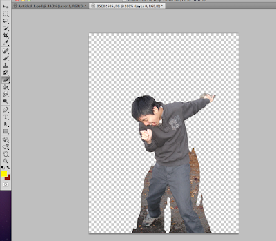
Screen Grabs of Media Fails! Episode 1
So as you all know, we're working on our front covers now. But what you don't know is that I've been taking screen grabs of my failure. Wanna see them? Sure you do.



This circle is much too dark :(

Much better and better for the colour scheme :D

Getting my logo on the internet. Megaphone, yeah! It's loud and aggressive urgghh!!!

Basic formatting, hmmm. Seems a bit messy. I also got to sort out that background. Houses aren't very rockstar. :/

This microphone is going out of contrrroool!!!

The image I was using before the new one. Trying to erase myself with only the eraser tool, I think I need to use the selection tool next time though.
See you next time on....
Screen grabs at Media Fails!
Tuesday, 13 November 2012
Improvements? PEER REVIEW TIME!

Sunday, 11 November 2012
A True Photoshoot!
Some good photos I took over the weekend!!!


Are we badass, or are we badass?

A single shot of me with a guitar, I thought it would be interesting if I pretended if it was a gun, to continue with that rebel theme.

Don't want to meet us in a dark alleyway huh?

A development of the other im age before with the symbol to our heads.

Invisible megaphones?

Behold! Our fearless leader!

Megaphone.

God, megaphones again?

NO.

Lighting is bad in this one, so I probably won't use it. Trying to kill the other band members by bashing them in with my guitar.

Trying to show the "togetherness" of the band. FRIENDSHIP!!!

A parody of that beatles pose, with one person jumping. She's too far off though.

Single shot. He really liked that guitar.

Some more CRAZY positioning.

Single shot. Guitars...again.

Invisible megaphone!

Trying for a more serious look. Change of wardrobe too.

More badassery of me. I pull it off obviously.

I dunno? Herp-derp. Might look good on the double page spread though.

Trying to stick with the double page spread plan. Hold that remote!

Another pose, with this guy in front. But I'm pulling a ridiculous face, so I won't use it. VANITY.

More re-shooting. Too much smiling.

Eyes closed. STOP IT WITH THE INVISIBLE MEGAPHONES ALREADY!

I look drunk, ssoooo no.

Arms are in the way of our beautiful faces.

ARGHHHH! (you know what I'm talking about.)

TOO MUCH SMILING!

TOO HOBO-ISH.

Seriousnes, probably will use this.

Why do I keep pulling these dumb faces?!!

Wait, isn't this exactly the same as the other one? -.-;
Subscribe to:
Posts (Atom)