My latest contents page. I added more colour to the top half of the page because apparently it was too "blank" so the business of the whole page was realllly off. I also added more text and moved the images around to make it overall visually appealing. The colour scheme is the same as the front cover, so it has a continuity. Anyways, you know what to do, leave a comment down on the crotch!
Wednesday, 28 November 2012
Tuesday, 27 November 2012
Feedback time!
Okay you unrelenting monsters! It's feedback time on my contents page version one! I also put up my cover page so you can see the comparison. Now type! TYPE GOD DAMMIT!
Developing my contents page. (+ William Photoshop Fails Ep 2!)
Well, you guys, I finished my front cover! Rest assured that I DID get rid of that horrible background texture, so no worries. :D
But now I have to do a contents page. Yaayyy, work. -.-
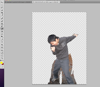
So here's what I've been doing so far!
This also counts as William Photoshop Fails episode 2 so enjoy that too.
But now I have to do a contents page. Yaayyy, work. -.-
So here's what I've been doing so far!
This also counts as William Photoshop Fails episode 2 so enjoy that too.
Some sticky tape images I got from the internet. Gonna use them to make my contents page more collagey, hoyhoyhoy.
UGHHHH. WHAT IS THAT. THAT HORRIBLE BRUSH MAN-MADE LINES. GET IT AWAY! AWAY I SAY! THE AMATEURISH APPEAL!
So after that horrible nightmare, I was able to get some custom grunge brushes instead. Inner mind is at ease, looks more clean.
More brush Shenanigans, trying to lower the opacity so the text is more visible...
Welp, I changed my mind on the colour. Red looks so much more fabbbulous.
It fits the colour scheme as well and whatever. You know all that design stuff.
I'm probably gonna add more later when this contents page really begins to set itself on fire.
Tuesday, 20 November 2012
MORE FEEDBACK!!
Here's my final version, hopefully. If there's anymore feedback, or imperfections I need to delete please tell me now or I'm going to live with an ugly project forever. D:
COMMENTS GO GO GO!
Friday, 16 November 2012
Need some more Feedback peoplez!
So I think I'm done, but what do you guys think? I'm a bit vain and think it's absolutely FAAABBBULOUS. Give me your thoughts so I won't sound so much like a snob and also to improve my cover (obviously.)
Thank you guys!
Thank you guys!
Screen Grabs of Media Fails! Episode 1
So as you all know, we're working on our front covers now. But what you don't know is that I've been taking screen grabs of my failure. Wanna see them? Sure you do.
This circle is much too dark :(
Much better and better for the colour scheme :D
Getting my logo on the internet. Megaphone, yeah! It's loud and aggressive urgghh!!!
Basic formatting, hmmm. Seems a bit messy. I also got to sort out that background. Houses aren't very rockstar. :/
This microphone is going out of contrrroool!!!
The image I was using before the new one. Trying to erase myself with only the eraser tool, I think I need to use the selection tool next time though.
See you next time on....
Screen grabs at Media Fails!
Tuesday, 13 November 2012
Improvements? PEER REVIEW TIME!
So guys, here's my cover page I'm making so far, trying to patch the image up to make myself look pretty! (and feel pretty *Desperation for attention mode on*) But I want to hear what you guys think, I want critiques people! Talk about my colour scheme or what I can do for arrangement and other stuff like that. Tell me how skinny I am, anything will be great, (I'm the asian one!).
Sunday, 11 November 2012
A True Photoshoot!
Some good photos I took over the weekend!!!
Are we badass, or are we badass?
A single shot of me with a guitar, I thought it would be interesting if I pretended if it was a gun, to continue with that rebel theme.
Don't want to meet us in a dark alleyway huh?
A development of the other im age before with the symbol to our heads.
Invisible megaphones?
Behold! Our fearless leader!
Megaphone.
God, megaphones again?
NO.
Lighting is bad in this one, so I probably won't use it. Trying to kill the other band members by bashing them in with my guitar.
Trying to show the "togetherness" of the band. FRIENDSHIP!!!
A parody of that beatles pose, with one person jumping. She's too far off though.
Single shot. He really liked that guitar.
Some more CRAZY positioning.
Single shot. Guitars...again.
Invisible megaphone!
Trying for a more serious look. Change of wardrobe too.
More badassery of me. I pull it off obviously.
I dunno? Herp-derp. Might look good on the double page spread though.
Trying to stick with the double page spread plan. Hold that remote!
Another pose, with this guy in front. But I'm pulling a ridiculous face, so I won't use it. VANITY.
More re-shooting. Too much smiling.
Eyes closed. STOP IT WITH THE INVISIBLE MEGAPHONES ALREADY!
I look drunk, ssoooo no.
Arms are in the way of our beautiful faces.
ARGHHHH! (you know what I'm talking about.)
TOO MUCH SMILING!
TOO HOBO-ISH.
Seriousnes, probably will use this.
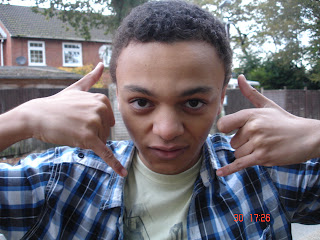
Why do I keep pulling these dumb faces?!!
Wait, isn't this exactly the same as the other one? -.-;
Wednesday, 7 November 2012
Photoshoot Plan
Location: For the front cover I would like to use a more empty and blank location, so that it would make it easy for me to edit in photoshop later on, as there would be too many elements for me to edit if the location was more busy. This would go the same for the contents page. As for my double page I would like to use a grungy urban area that emphasizes the colour grey. This is because the area as it is an area that most rebellious teenagers inhabit, clearly defining the theme of rebellion, which is what pop-punk is mostly about.
Props: There are a variety of props I am planning to use. One would be a megaphone, which I am planning to give to the models for the front cover to use. This would replace the traditional microphone and make the magazine seem more louder and "in your face", following the themes of pop-punk. The second prop I am planning to use is headphones for my contents page, to follow the layout plan designs where the contents elements would emanate from them. It is also a major symbol of music. Any other prop used would be for the use to indicate that it is a music magazine (i.g musical instruments, guitar, ukelele etc.).
Model: I am only planning to use three models, including myself. Three for the front cover, two for the contents page and three for the double-page spread. They will be a boy and girl, both who are the same age as I am, so they will be easy to work with and each are very reliable and contactable as they are both my closest friends. They both also have access to a range of clothing that I may use for my photoshoot.
Clothing: I am planning to use two types of clothing for this photoshoot, as I am still undecided on which one I am going for. This first type would be in quite plain, normal clothes. One that fits the cliche of the "indie" style/look. Another type would be a more dark, Gothic and formal attire, so that it would fit more closely to the image of "punk" rather then the other type which describes more of a "pop-punk" feature.
Lighting: For the front cover, I want the lighting to be mid-dark, this is because it would be mainly shot from outside. For the contents and double-page spread I would like it to be quite bright, this can be easily re-created indoors. These are created for highlighting the details on models as well as setting moods in the images.
Poses: I have thought up a variety of poses that I would want my models to do. For my front cover I thought that the models might pose with the megaphone, shouting on it and pretending it is a microphone for a different and louder looking effect. For the content page, I have thought of a meditating pose with the hands covering over the headphones for a serene effect. As for the double page spread, I think that a sitting pose is good so I can draw Television sets over them and make a merge between the two types of layout, making an interesting piece. Various other poses include "natural" poses, some that are taken just randomly to show the naturalness of the models.
Poses: I have thought up a variety of poses that I would want my models to do. For my front cover I thought that the models might pose with the megaphone, shouting on it and pretending it is a microphone for a different and louder looking effect. For the content page, I have thought of a meditating pose with the hands covering over the headphones for a serene effect. As for the double page spread, I think that a sitting pose is good so I can draw Television sets over them and make a merge between the two types of layout, making an interesting piece. Various other poses include "natural" poses, some that are taken just randomly to show the naturalness of the models.
Tuesday, 6 November 2012
Sunday, 4 November 2012
Photoshoot Images
Here's some of the first images from the first photoshoot I did. Prooobably going to re-do them.
I didn't use a photoshoot plan for these images, so I would need to use one for my next one as this photoshoot was mostly improvised. Which is quite bad, since that's not very structured.
I didn't use a photoshoot plan for these images, so I would need to use one for my next one as this photoshoot was mostly improvised. Which is quite bad, since that's not very structured.
Subscribe to:
Comments (Atom)


